Feature / The SPC advantage
 Traditional financial reporting tends to rely on comparing two points – the amount spent this month compared with the amount spent last month. Or it looks at the cumulative year-to-date performance against the target. But both approaches tell you nothing about trend or allow for natural variation.
Yet spotting trends over time can be important. Problems with the payment of suppliers, for example, can provide early warning signs of cashflow and liquidity difficulties.
Month-to-month changes could be the result of natural variation – so making alterations on the back of a ‘dip’ in performance would not necessarily be the right response. And if you simply look at cumulative performance against a target, you might miss the fact that underachievement is due to earlier problems that have now been addressed.
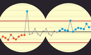
This point-to-point analysis can be compounded by RAG (red-amber-green) ratings, which can set alarm bells ringing without due cause – triggering an unnecessary reaction to a variation within the range you expect to see. Instead, SPC charts show a time series of data with at least three reference lines – the average performance and an upper and lower control limit showing the boundaries of normal variation.
Within the limits
The limits are determined by thevariability of the data, so that about 99% of data points fall between the limits. Neither the readers nor compilers of the chart have to understand how the limits are calculated; readers simply need to trust that they set the boundaries for normal variation and the freely available software provided by NHS England performs the calculation for chart compilers.
(For those of you who would like to know, NHS England’s Making Data Count team teaches a type of SPC chart known as an XmR chart with the control limits 3σ (three sigma) away from the mean. Sigma is a type of standard deviation that takes into account the order of the data and is defined as the mean moving range divided by 1.128.)
In addition, a target line can be included if that is relevant. The charts are intuitive. Readers can clearly see the trends and spot where performance has been outside of normal variation. There are also rules to help users understand when something unusual is happening. You generally have what is known in SPC circles as a special cause variation if:
• A data point is outside the process limits
• A run of (typically) six consecutive points are above/below the mean
• There are six consecutive points increasing or decreasing
• There are two out of three consecutive points close to the process limits.
Colour coding
Colour coding can highlight whether the special cause variation is of particular concern and needing action (orange) or if it suggests improvement (blue). Grey data indicates no significant change or common cause variation. 
Annotations can also show where changes were introduced that could explain subsequent changes in data or add in supporting comments – although the Making Data Count team warns against spuddling (making a lot of fuss about trivial things as if they were important).
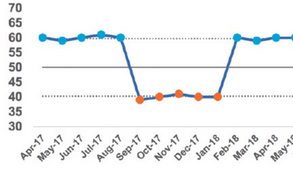
Things can happen or changes can be made to a process that lead to a step change in the data – and this may require the mean and the process limits to be recalculated.
However, this should be a measured decision based on the identified change being statistically significant, ideally resulting from a known cause, and confidence that the change has been embedded (perhaps with a run of at least 12 data points).
Use of icons
![]()
The Making Data Count team has already supported 500 people across the NHS finance community through its Step one for finance training course (the team’s more general training includes eight training steps), with sessions run quarterly.
There are also four innovations published using SPC for finance in the One NHS Finance innovation library. And a new mini guide to support the use of SPC in finance is due to be published in the coming weeks.
• For further information about statistical process control, visit the NHS England website – hfma.to/mar231 – or see the Making Data Count workspace on the Future NHS portal – future.nhs.uk/MDC
Related content
The value masterclass shares examples of organisations and systems that have pursued a value-driven approach and the results they have achieved.
We are excited to bring you a fun packed Eastern Branch Conference in 2025 over three days.