Feature / Reading between the lines
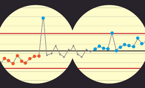
 Something is happening to NHS finance board reports. Gone (well, going) are the detailed table and text heavy affairs with liberal use of RAG (red-amber-green) ratings to show performance. In their place is a new breed of reports, full of ‘new’ statistical process control charts.
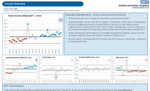
In some cases, the change is dramatic. At Oxford University Hospitals NHS Foundation Trust, the first thing non-executives saw in their January finance report was a collection of five SPC charts showing the trend on monthly income over the past two and a half years (see below).
You can still clearly see how the income compares with the previous month, but you get the added information on the long-term trend and can see how this has varied over time compared with the average level of income, and where any major spikes or troughs have occurred.
Turn the page and you find SPC charts used to analyse the pay run rate. On the next page, nine SPC charts give a detailed breakdown of the spend on non-pay. And the appendices overflow with more of the same. 
The charts are intuitively easy to understand and enable targets to be included, where these exist, as well as helping readers to understand the difference between normal variation and variation that they should be concerned about or that demonstrates improvement.
SPC pioneer
Kay Wiss, director of finance at Stockport NHS Foundation Trust, is one of the pioneers of using SPC charts to show financial performance. In 2018, after the trust was rated as requiring improvement by the Care Quality Commission, NHS England’s Making Data Count team was dispatched to the trust as part of a wider support programme. Its focus was to improve the trust’s integrated performance report as part of improving decision-making across the trust.
Exposed to some of the SPC training, Mrs Wiss – the 2022 HFMA Deputy Finance Director of the Year – decided the approach could be used in a different way – to help tell the story of the financial position. In particular, she wanted to use the SPC approach to throw a spotlight on the issue of workforce, and specifically the cost of temporary staffing.
The ability to see trends and whether variation is normal or something to be concerned about means the trust isn’t wasting time worrying about things that don’t need fixing and can concentrate on those that do. Instead of a narrow focus on this month versus last month or a one-time comparison with a target, the trust gets to see a bigger picture.
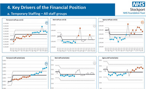
‘The traditional approach to reporting staffing costs simply doesn’t tell you what you need,’ she says. Mrs Wiss started with six SPC charts, showing monthly spend and whole-time equivalents actually working broken down by permanent staff, bank staff and agency staff and going back 17 months. If the trust’s aim of increasing permanent staff and reducing reliance on temporary staff was being achieved, this should be clearly visible in the whole-time equivalent charts. The spend charts would show if this was matched by the anticipated reduction in costs.
With further drilldowns into medical and nursing staff, the charts have also helped identify specific cost drivers. ‘This allows us to focus on what we should be looking at, not looking at everything,’ she adds.
January’s report to the finance and performance committee, where SPC charts have been most used at the trust, continue to tell the story on temporary staffing. The charts show that, while permanent staffing levels are going up, bank and agency costs have not started to reduce.
This is the result of a combination of higher agency rates (particularly for medical staff), the need for extra staff while international recruits gain the objective structured clinical examination to demonstrate competence, and the need to staff escalation wards as a result of emergency demand and discharge hold-ups. But the charts have helped the trust gain a more nuanced understanding of staff costs and drivers.
Stockport has also started to use SPC charts at divisional performance meetings. ‘These meetings look at quality, operational metrics, workforce and finance, so we replicated the workforce charts at that level too,’ says Mrs Wiss.
‘And this really does start to show what is driving a division’s financial position. We’ve even used them at ward level and there are things that get highlighted that enable you to take prompt action,’ she says.
In one example, the charts highlighted rising agency costs that were linked to sub-optimal rostering, which was quickly fixed with some additional training. According to Mrs Wiss, that made tens of thousands of pounds of difference in one month.
All finance staff are now trained in using SPC charts. But she says the charts are simple to produce and use. ‘It is really easy and it’s free, because the resources are all online. You can just have a go and you can’t break anything.’ Mrs Wiss has presented on the use of SPC in finance at HFMA and other events and is an ambassador for NHS England in encouraging wider adoption. Her current focus is on spreading use of the charts across Greater Manchester, so that the whole system can start to explore trends on agency and bank staff and consider the potential for combined action where needed.
Controls assurance
‘When we started thinking about how to use SPC charts, we decided to anchor back to their core purpose. For us that was about looking at our financial processes, using the SPC charts to determine whether our processes are under control,’ says Andrea Osborne, the trust’s deputy director of finance. ‘This took the trust in the direction of the financial controls report to its audit committee.
The report uses SPC charts in specific areas – showing performance against the better payment practice code (BPPC), aged debtors and creditors and procurement waivers. While the committee sees the cumulative performance on BPPC, as this is how the trust is monitored, the finance team also looks at monthly performance.
‘That is what can give us the early warning sign,’ she says. ‘If your in-month performance is starting to vary, that’s an indication that in a couple of months the change will impact on your cumulative performance.’
Response to the use of the charts has been positive. ‘We’ve issued two reports into audit committee and they’ve gone down well. The non-executives like to see the trends in the data and they are starting to understand how to interpret the charts,’ she says.
Each SPC chart is presented with accompanying numbers and narrative, and supplemented by detailed charts in the appendices.
The trust is also expanding use of the charts in the finance team, particularly around pay and non-pay analysis. Ms Osborne says SPC charts are starting to help with month-end reporting. ‘Sometimes it is about looking at the control limits to understand the level of variation,’ she says, ‘because that can signal issues with your processes that impact on the quality of your data.’
The charts also provide a handy way of checking for consistency in data flows. For example, the trust’s workforce return and finance return are produced by different systems. ‘One thing we’ve done is bring the data together using SPC. We can see trends and this is alerting us to possible issues,’ says Ms Osborne. ‘That’s what SPC does – it prompts you to ask more questions – and that’s helping us improve the quality of our financial reporting.’
Finance focus
Stockport was relatively unique when it started to use SPC charts in finance reports. Nikki Greenwood, deputy director of intensive support at NHS England, says that 190 NHS bodies use SPC to report operational performance, but about 30 use them specifically for finance.
She believes SPC charts offer a way of improving clinicians and non-finance staff engagement with finance information. ‘Often, with finance data, people don’t think it is important to them or they just don’t understand it,’ she says. And that might mean they don’t challenge the data because they don’t want to be exposed for not understanding it.
‘One of the beauties of SPC is that it is really simple and you can look at an SPC chart related to finance for anything and be able to say something about it,’ she adds.
Oxford University Hospitals has really taken the approach to heart. ‘We started using SPC charts in the annexes of our board paper about a year ago,’ says Jason Dorsett, chief finance officer. ‘And we’ve taken ourselves and the board on a journey and progressively transitioned more and more data to being presented via SPC charts.’
The response was immediate and positive. ‘Non-accountants find a graphical presentation of data easier to understand than a table and if you are trying to present data in a trend format, simply shifting from a table with rows of numbers to a chart makes a big difference. A non-executive without much extra training can understand a run chart.’
The charts also help to prevent inappropriate responses to normal variation. Yael Hunt, finance performance manager at the trust, and self-confessed SPC enthusiast, highlights how easy it is to read a chart. ‘It was about six months before the board had any training,’ she says. ‘But we were still comfortable presenting the charts.’
The colour coding of special cause variation (as opposed to common cause or normal variation) is intuitive and people understand the concept of upper and lower process limits, even though they do not need to understand how they are calculated.
‘Previously our board reports were full of financial tables with narratives that were really repetitive with lots of two-point comparisons, this month with last month. SPC gives you the whole story,’ she says. ‘It also gives you the ability to triangulate data.’
So, a human resources SPC chart might show sickness rates going up, with lots of orange dots. But a finance chart on temporary staffing will show the same story from a different angle, confirming the data and clearly showing cause and effect.
Similarly, the trust has been able to show the link between increased length of stay, the need for additional capacity and rising pay costs.
Mr Dorsett says automating the production of SPC charts within the Power BI reporting software has been a game-changer. While the Making Data Count templates are ‘great’, Mrs Hunt admits that producing lots of charts for the board report was a time-consuming exercise in cut and paste. Now it is a simple push of a button – with the required code again provided free to the organisation by NHS England.
Not just about variation
Finance data doesn’t always lend itself to the SPC approach, admits Steve Orpin (pictured), deputy chief executive and chief finance officer at Maidstone and Tunbridge Wells NHS Trust. ‘When you think of board-level metrics, income and expenditure performance in a month, for example, that can vary wildly depending on what month of the year it is,’ he says.
Things like cash and cost improvement programmes work on a 12-monthly cycle, he says, so the longitudinal analysis of SPC doesn’t always fit. But the trust is a big supporter of using SPC charts to report performance across all its strategic themes – patient access, clinical effectiveness, patient experience and financial sustainability.
Non-executive directors have really bought into the use of the charts, which have been used extensively throughout the trust’s integrated performance report since before the pandemic.
The trust has even introduced its own touches. It has added a red border to charts where an issue being monitored has been escalated as an area that needs to be looked at and introduced additional assurance icons to distinguish between a metric that is consistently passing or failing a target and one that is only just passing/failing.
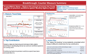
The board receives a summary of financial targets, with SPC icons showing where variation is causing concern and targets being hit or missed. These cover the delivery of the financial plan, cash balance and capital spend. The trust has also been reporting against its target to reduce monthly agency spend – a target it has been consistently missing for more than six months. But there is still a focus on the absolute financial position.
‘Finance works in absolutes,’ says Mr Orpin.  Even if an SPC chart suggests an overspend is within the normal range of variation, the trust is managed on the basis of breaking even and might need to take action. So Mr Orpin sees SPC as an adjunct to more traditional financial reporting to boards, providing additional insight rather than replacing it.
‘But [SPC charts] can be really useful to share with service managers, operational managers and clinicians to show why you are concerned about something and how performance has changed over time compared with the mean and the target. They are a great communication tool, highlighting patterns over time really clearly,’ he says.
Triangulation is a key benefit of the wide use of SPC charts – something brought into sharp focus in monthly ‘visual management’ meetings, where the executive team gets together to look at a display of all the key metrics. ‘We can see our vacancy rates and staff turnover figures are improving. And we can see an improvement in falls, which we know is directly related to nurse staffing on wards. That’s great. But we’re not seeing a change in agency usage.’ What the trust has realised – and this has been helped by the visual presentation using SPC charts – is that some of the improvements will take a little time to have an impact on the metrics. Vacancies may be filled, but you may need to allow for different start dates or induction periods.
Mr Orpin says: ‘That’s a real-time conversation among all the executive team, driven by our use of SPC charts and our improvement methodology – and finance is a part of that.’ There is more use of SPC charts in the report to the finance performance committee, with a deeper drilldown into pay costs than in the board report. ‘One of the areas we want to get into is showing forecasting in an SPC chart,’ says Mr Orpin.
He adds that because forecasts are clearly subjective, rather than actual hard figures, there is a question about whether showing them in an SPC chart is meaningful. The trust is also exploring how the use of SPC charts can help with planning for the new financial year.
Levels of analysis
Being able to produce analysis at different levels is another benefit. ‘We were seeing rising pay in one area and we’ve been able to drill down into the data and show exactly which staff group is driving it and link the increase to additional sessions,’ says Mrs Hunt.
The presumption might have been that temporary staff costs were driving the increase, but the link to additional sessions simply wasn’t visible in the high-level data. ‘Fast forward a month and we had controls in place and were already mitigating what was going on,’ she adds.
In another example, SPC analysis helped assess the appropriateness of introducing a winter incentive scheme to encourage further bank take-up. The automation of chart production becomes particularly powerful for directorates, where a finance manager can drill down into income and expenditure below the overall trust level – providing SPC charts on different income, pay and non-pay categories for pharmacy, for example.
‘This is such a valuable tool for a head of finance when in discussions with clinicians,’ says Mrs Hunt. ‘It is the other aspect of automation – making it accessible and really driving it deep in the use of day-to-day finance, not just reporting.’ Statistical process control won’t replace all traditional ways of reporting financial data in the NHS (see Not just about variation page 16). NHS finance still deals in absolutes in many areas. But trends and variation over time can provide a richer understanding of the financial position. And if you aren’t already using SPC charts to enrich your financial reporting, it is likely you soon will be.
Related content
The value masterclass shares examples of organisations and systems that have pursued a value-driven approach and the results they have achieved.
We are excited to bring you a fun packed Eastern Branch Conference in 2025 over three days.